Branding
RED USA
RED USA develops, sells and manages real estate from an office in Miami Beach. I designed its logo, business card and website as one identity: the flag's red, white and blue, a skyline drawn in line, and classical capitals with the formal look of carved inscriptions. The website opens in English, Italian or Spanish, and the colors and the skyline say American property before a word in any of them is read.
Project story
The project
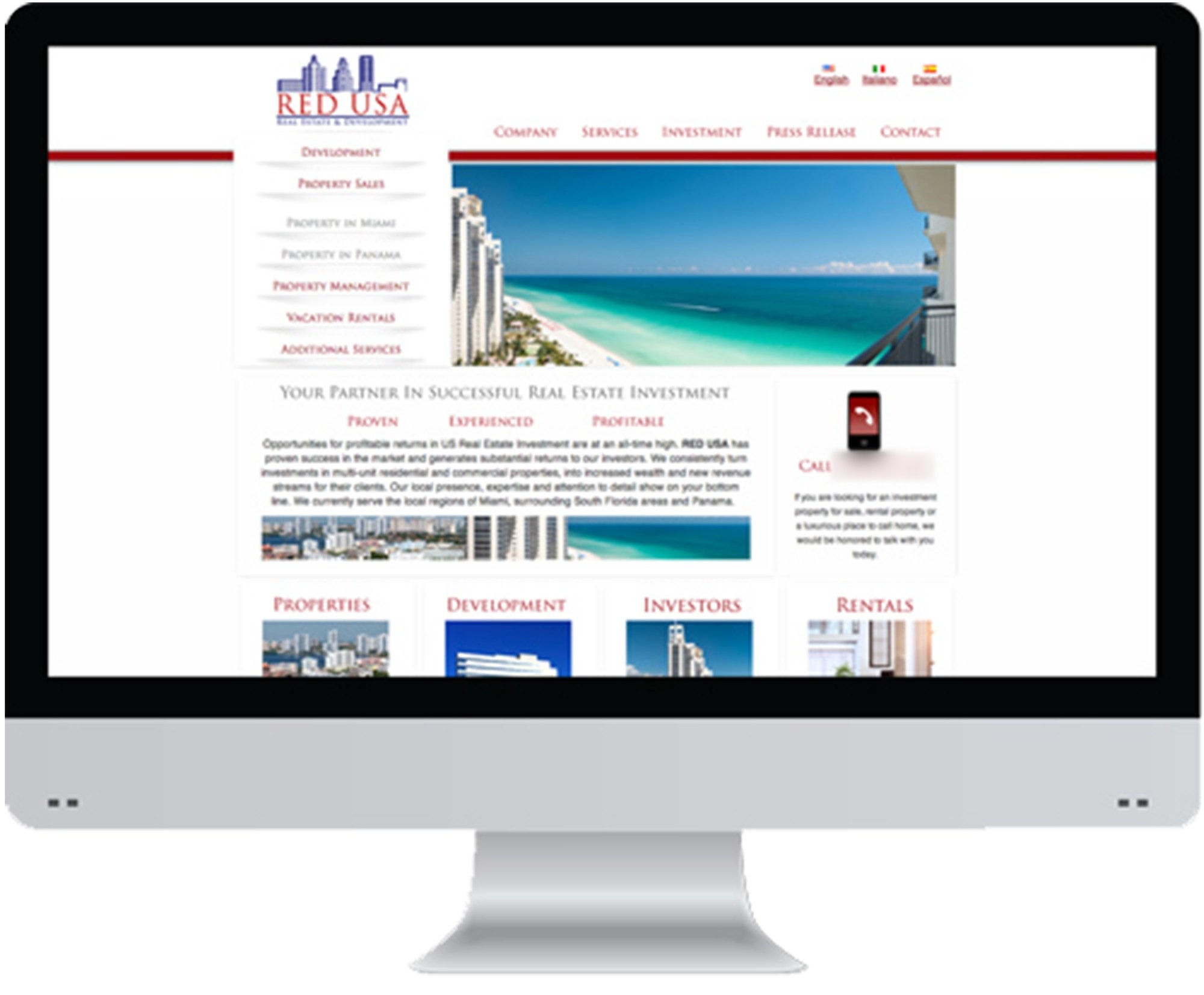
The website's side menu maps what the firm offers: development, property sales, property in Miami and in Panama, property management, vacation rentals and additional services, with investment and press releases in the main navigation. Four tiles further down the page sort visitors by what they came for: properties, development, investors or rentals. The identity speaks to all of them at once, the renter and the buyer as much as the investor.
The identity
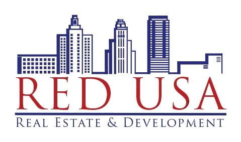
The name, RED USA, is set in red, #bc1d22, and red appears nowhere else in the logo. Deep blue, #232879, draws the skyline, the rule and the tagline, thinning to a blue gray, #4c5090, in the finest lines, and white is the ground on every surface, so the three colors stay crisp and apart. The type works in two registers: tall serif capitals with fine strokes and sharp serifs for the name, and spaced small capitals for the supporting lines, from the tagline to the card's contact details and the website's menus. Only the website's running text steps down to a plain sans serif, for reading at length.
Logo design
From left to right, the skyline shows square windows on a low block, a stepped crown over a broad tower, vertical lines up a slim tower, floor bands across a tall slab, and only a few short marks on a low building at the end. The heights rise and fall like a bar chart, a fitting second reading for a firm with a page for investors. The slim tower stands directly over the gap between RED and USA, tying the drawing to the words beneath it. A heavy rule closes off the name, and skyline, name, rule and tagline share one width, so the mark stacks into a compact block that holds together at any size.
Supporting work
The card and the website show the identity at work. On the card, red stays inside the logo and every other line is set in blue, so the firm's name is the one warm note. On the website the roles turn around: red takes the navigation, the rule under the header and the titles of the four tiles, while photographs of white towers over turquoise water supply the blue and set real buildings beside the drawn ones.
The work
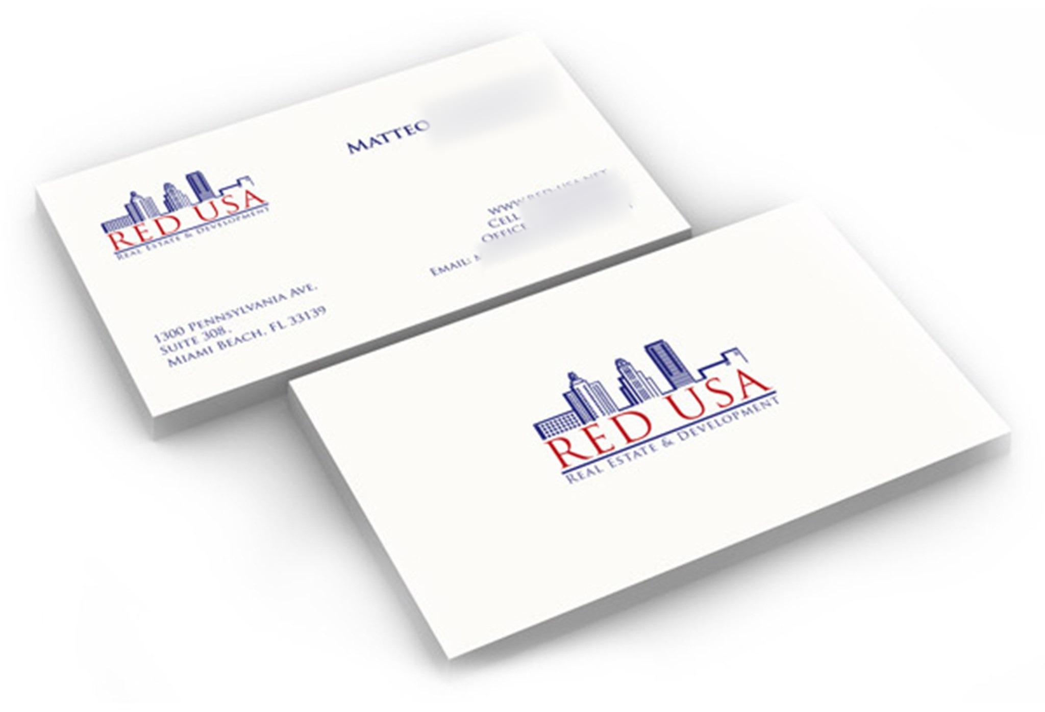
Two cards on white stock. The front centers the full logo and nothing else; the back sets a smaller logo at the top left, a name across the top, the contact lines at the right and the office address at the lower left.
The logo stacks four parts: the blue skyline, RED USA in red, a blue rule, then Real Estate & Development as the tagline. Read by its full capitals alone, the tagline gives R, E and D, spelling out the name above it.
The website on a desktop screen. Language links under small flags sit at the top right, and a white side menu hangs below the logo. Under the beach photograph, a gray heading about real estate investment stands over three words in red, beside a call box with a red phone, and a row of four tiles closes the screen.